

Wabi Sabi is not about making a home look empty or perfectly beige. It is about slowing down, appreciating natural beauty and allowing materials, shapes and objects to show a little of their own character. In wall art, this creates a quiet visual language built around earthy colors, organic forms, subtle texture and meaningful simplicity.
What Is Wabi Sabi?
Wabi Sabi is a Japanese aesthetic associated with simplicity, impermanence and the beauty found in things that are imperfect or incomplete. In contemporary interiors, these ideas are often expressed through natural materials, restrained decoration, organic shapes, muted colors and a sense of space.
The important point is that Wabi Sabi is more than a visual formula. A room does not become Wabi Sabi simply because it contains beige furniture and a minimalist print. The feeling comes from the relationship between materials, light, texture and the objects chosen for the space.
Think of an aged wooden table, a handmade ceramic vase, soft linen, stone, clay and a piece of wall art that feels quiet rather than demanding attention. Together, these elements create a home that feels grounded and lived in.
The Design Principles That Give Wabi Sabi Its Quiet Character
Natural materials come first
Wood, stone, clay, linen and other tactile materials are closely associated with the Wabi Sabi approach because they reveal texture and natural variation. The same principle can guide wall art. Instead of choosing an extremely glossy or visually aggressive print, look for artwork with soft colors, organic shapes, painterly texture or a restrained composition.
Imperfection creates character
Wabi Sabi does not mean making a room messy. It means allowing small irregularities and natural variation to have a place. A slightly asymmetrical composition, an imperfect botanical shape or a weathered inspired color can make a space feel more human.
Simplicity should still feel warm
One of the easiest mistakes is confusing Wabi Sabi with a completely empty room. The goal is not to remove personality. Instead, choose fewer pieces and give each one enough visual space to be appreciated.
Let negative space become part of the decoration
A Wabi Sabi wall does not need to be completely filled. Leaving breathing room around a painting can actually make the artwork feel more intentional. This is especially useful when the room already contains natural wood, textured textiles or decorative ceramics.
The Wabi Sabi Color Palette
Wabi Sabi colors are generally inspired by nature rather than bright artificial tones. Warm ivory, sand, beige, clay, terracotta, muted green, olive, warm gray, brown and charcoal can all work beautifully when they are layered with subtle differences.
The most beautiful Wabi Sabi rooms usually avoid using these colors at equal intensity. Instead, start with a quiet neutral background and introduce one or two deeper natural tones through artwork, ceramics, textiles or wood.
Why Canvas Art Works So Well With Wabi Sabi Interiors
Wall art has an important role in a Wabi Sabi room because the walls themselves can otherwise feel too bare. The right artwork adds personality without destroying the calm atmosphere.
Neutral canvas art can echo the tones of plaster, linen, stone and natural wood. Botanical designs can introduce a subtle connection with nature. Abstract compositions can add visual texture without creating a strong literal focal point.
The key is to choose artwork that supports the room rather than competing with it.
Wabi Sabi Canvas Wall Art Ideas for a Calm Home
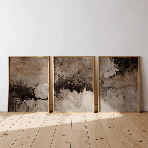
1. Create a warm neutral focal point
If your room already uses cream, beige, warm white or natural wood, a neutral Wabi Sabi canvas set can become the visual anchor without introducing a completely new color family.
The three piece Japanese inspired canvas set below works particularly well above a sofa, low console or bed where several related shapes can create rhythm while keeping the overall composition restrained.
2. Bring terracotta and botanical warmth into the room
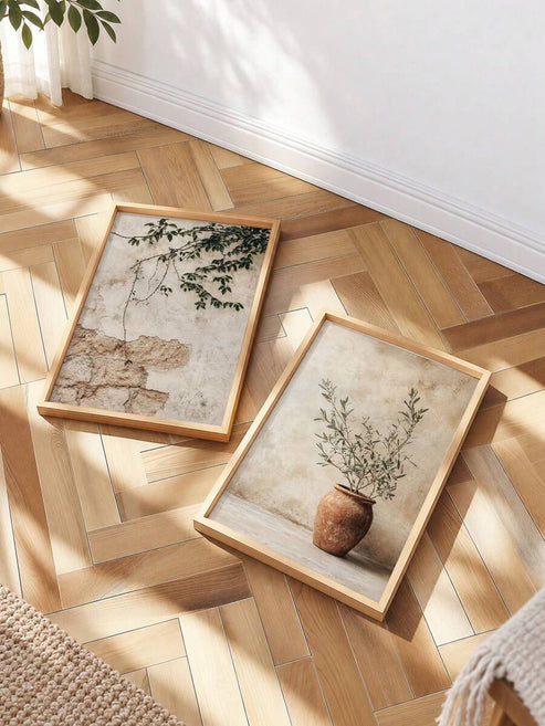
Wabi Sabi does not have to be completely gray or beige. Terracotta is useful when a neutral room needs a warmer point of interest. Botanical imagery also works naturally with the philosophy because it brings the forms and colors of the natural world onto the wall.
A terracotta vase and olive branch inspired composition can work especially well in dining rooms, kitchens, entryways and living rooms where earthy colors already appear in wood, ceramic or woven materials.
Explore the neutral botanical terracotta canvas set
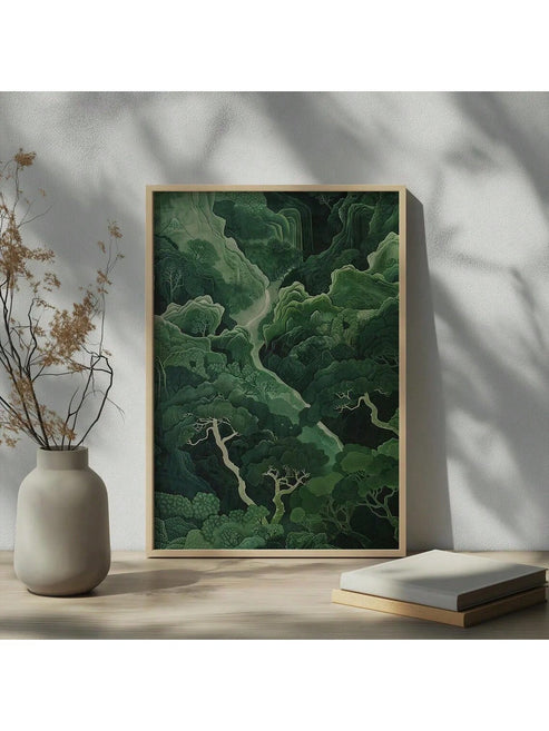
3. Use muted green for a softer connection with nature
Sage and faded green can be especially useful when a room needs a little color without becoming visually loud. These shades work beautifully with warm white walls, light oak, beige upholstery and natural woven textures.
See the sage green Wabi Sabi nature wall art
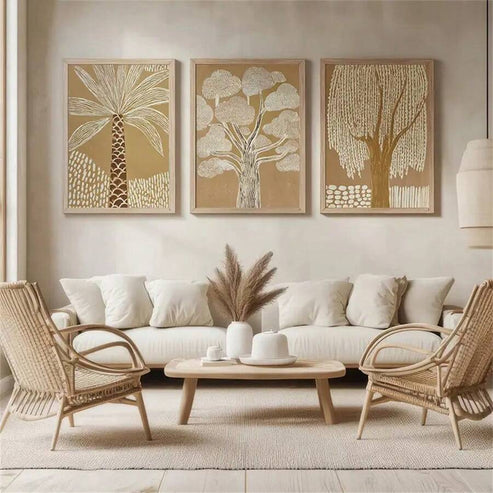
4. Choose organic line work for a minimalist room
When the furniture is already simple, a wall artwork based on an organic line or abstract tree can introduce movement without adding visual clutter. This is a good approach for bedrooms, reading corners and home offices where the goal is to create a calm background.
View the abstract textured tree Wabi Sabi canvas
5. Blend Wabi Sabi with Scandinavian simplicity
Wabi Sabi and Scandinavian interiors can work together because both appreciate simplicity, natural feeling and restrained decoration. The result can be especially attractive in modern apartments where you want warmth without heavy ornament.


Use these styles with pale wood furniture, linen upholstery, simple ceramics and soft lighting. Keep the number of decorative objects limited so the wall art has enough space around it.
How to Use Wabi Sabi Wall Art by Room
Living room
The living room is the easiest place to make Wabi Sabi wall art the main visual feature. Place a larger artwork above the sofa or console and let the surrounding wall remain relatively open. Warm beige, clay, muted green and brown artwork pair naturally with wood and linen.
Bedroom
In the bedroom, choose artwork that feels quiet rather than energetic. Soft botanical shapes, abstract trees and neutral compositions can help establish a slower visual rhythm above the bed or on a side wall.
Home office
A Wabi Sabi inspired office can feel calmer without becoming boring. Choose one understated piece rather than filling the wall with many competing images. Organic line art and muted landscapes are particularly suitable when the room already contains books, wood furniture and natural textures.
Entryway
The entryway is a good place for a small statement of the style. A botanical canvas or earthy abstract piece can immediately establish the mood of the home without requiring a large gallery wall.
How to Balance Wabi Sabi Art With Furniture and Decor
Think in layers rather than matching every object. If the artwork contains warm beige and brown, repeat those tones subtly through a wooden bench, ceramic vase or woven basket. If the artwork includes muted sage, echo it with one plant or a soft textile rather than painting the entire room green.
Texture is equally important. A smooth canvas can sit beside rough ceramic, natural wood or linen. This contrast creates depth while keeping the color palette restrained.
Common Mistakes When Decorating With Wabi Sabi Art
Making everything beige
Beige can create a beautiful foundation, but too much of the same beige can make a room feel flat. Add subtle differences through clay, sage, warm gray, brown or natural wood.
Adding too many decorative objects
Wabi Sabi works through restraint. If every shelf, table and wall is decorated, the room loses the sense of quiet space that makes the style attractive.
Choosing art only because it says Wabi Sabi
A product title can contain the words Wabi Sabi, Japandi or Zen, but the artwork still needs to work with your actual room. Look at its color, scale, composition and visual weight before deciding.
Confusing imperfect with unfinished
Wabi Sabi is not an excuse for a neglected room. The beauty comes from natural variation and simplicity that feels intentional. The space should still feel cared for and comfortable.
Wabi Sabi Wall Art FAQ
What is Wabi Sabi wall art?
Wabi Sabi wall art refers to artwork that expresses the quiet qualities associated with Wabi Sabi, such as natural colors, organic forms, simplicity, subtle texture and an appreciation for imperfect or understated beauty.
What colors are best for Wabi Sabi wall art?
Warm ivory, beige, sand, taupe, brown, terracotta, muted sage, olive, warm gray and charcoal are useful choices. The best combinations usually feel natural rather than highly saturated.
Can Wabi Sabi wall art work in a modern home?
Yes. Wabi Sabi can work particularly well in modern homes because its natural colors, organic shapes and restrained compositions soften contemporary furniture and clean architectural lines.
Is Wabi Sabi the same as Japandi?
They overlap but are not identical. Japandi combines Japanese and Scandinavian design influences, while Wabi Sabi is more strongly associated with appreciating simplicity, natural variation, imperfection and the passage of time.
Where should I hang Wabi Sabi canvas art?
Popular locations include above a sofa, bed, console, dining area, entryway or home office desk. The best location is one where the artwork has enough surrounding space to remain visually calm.
Does Wabi Sabi wall art have to be Japanese?
No. Contemporary Wabi Sabi inspired interiors can use botanical, abstract, landscape and minimalist artwork from many visual traditions. What matters most is the relationship between simplicity, natural color, texture and the feeling of the room.
Bring a Little More Quiet Into Your Walls
Wabi Sabi is ultimately less about decorating with a specific checklist and more about choosing pieces that make your home feel grounded, natural and personal. A carefully selected canvas can become that quiet point of beauty that gives the rest of the room space to breathe.
Explore Canvas Wall Art


